Creation of a Component in Angular Version 2+
Since January 1, 2022, when Google stopped updating AngularJS to fix security, browser compatibility, or jQuery issues, the Angular team recommends upgrading to Angular (v2+) as the best path forward.
From Angular V2 onwards, one of the significant changes was moving toward a component-driven framework. Hence, Angular Components is one of the significant changes in Angular v2 onwards.
What Are Components in Angular?
In Angular, a component stands as a fundamental building block of the application. Akin to Lego pieces in a structure, each component plays a specific role, ensuring the app’s functionality and user experience.
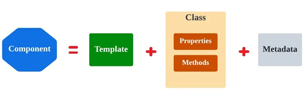
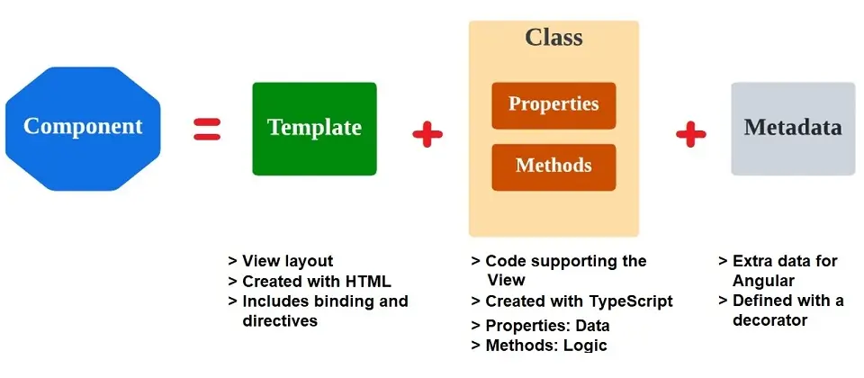
Structure of a Component:
Every Angular component is a combination of three core parts:
- Template: This is the HTML portion, which defines how the component renders on the UI.
- Class: Written in TypeScript, this defines the behavior, properties, and methods for the component. This is where the logic resides.
- Metadata: Provided by decorators, metadata offers additional information about the component. The most common decorator for components is “@Component”.
Features of a Component in Angular 2+
Encapsulation:
One of the unique aspects of Angular components is their encapsulation. Angular allows components to have their styles, templates, and logic bundled together, promoting a modular and organized codebase.
Hierarchy and Communication:
Angular applications are essentially a tree of components. A root component (usually AppComponent) serves as the base, with child components nested within. This hierarchy isn’t just for structural organization; it also facilitates communication. Parent and child components can exchange information, making it possible to build dynamic and interactive applications.
Reusability:
One of the significant advantages of using components is reusability. Developers can define a component once and use it across different parts of the application or even across different applications. This modularity speeds up development and ensures consistency in the user interface.
Lifecycle:
Angular components come with lifecycle hooks, which are specific methods that execute at various stages of a component’s life, such as its initialization or destruction. This gives developers fine-grained control over a component’s behavior throughout its existence. For more details, refer to Life Cycle Hook of Angular Components article.
In essence, Angular’s component-based architecture is a paradigm shift, emphasizing modularity, reusability, and encapsulation. Components are not just static UI elements; they are dynamic and interactive units that collectively shape the user’s experience of an Angular application.
Motivation for Moving Towards Components
The web development community has changed tremendously towards using web components during 2009 – AngularJS was also released in 2009.
With web components, developers can make modular code. With the realization of the power of web components, the Angular framework was migrated from directives to a components-based approach in Angular v2 onwards.
We can now create independent components with complete functionalities and inject them into our application with the component-based approach.
What Problems Does Angular 2.x Resolve?
Earlier in AngularJS, we bound our templates and controllers using the “$scope” injector. However, as the components are now directly associated with templates, there is no need for ‘$scope.’
Also, the versions from Angular v2 onwards have extremely well-defined life cycle hooks like ‘OnInit,’ ‘OnChanges,’ and ‘OnDestroy.’
How to Create a Component in Angular 2.x?
With a basic understanding of a component, let’s see how to create a component in Angular 2.x.
To create a component, we declare it with a special decorator, “@Component.” (We will cover more details on decorators in upcoming articles).
Essential Requirement to Create a Component in Angular v2 Onwards
- Import the component Object.
- Add meta-data to the Component using TypeScript Decorator.
- Export the Component.
- Bootstrap component.
- Include Component in Module.
Please refer to the diagram shown below:
Points to Remember:
- Every angular v2 onwards app should have at least one module known as the app module.
- Every Component that we declare must belong to only one module. (We will see this in action)
- Now, let’s see each step in detail and get into coding. We will create our first functional Component.
Import the Component Object
The first step in creating the Component is importing it from an angular core. The way to import is as follows:
import { Component } from '@angular/core'Angular v2 onwards makes use of ES2015 module syntax. In addition, it uses the import keyword to get code declared in different files.
The import relies on the export keyword. This means it must also be exported somewhere in a file to import a Component.
Adding meta-data to Components using TypeScript Decorator
Once we have imported a Component from an angular core, the next step is to declare it using the “@Component” decorator. Once Angular sees the “@Component” decorator, it will create a new component instance according to the configuration we specify.
import { Component } from '@angular/core'
@Component({
selector: 'my-products',
templateURL: 'app/products/product-list.component.html'
})
While creating a component, we can specify various configurations for a component. The most common configuration that we can give is as follows. For complete details of configuration, please refer to Angular Component Metadata.
- “selector“: Defines the name of the HTML tag where the Component created will live.
- “provider“: Here is where we pass in the service that the Component wants to access. I will be explaining more about the service in upcoming articles.
- “directive“: When we want to use other components, i.e., If this Component has a dependency on another component, we need to declare that Component here.
- “styles” or “styleUrls“: Styles specific to components are declared here. We can also pass the file where our styles are declared using styleUrls. Also, we can pass an array of style sheets to this option.
- “template” or “templateUrl“: HTML specific to components is declared here. We can also pass the file where our HTML is declared using “templateUrl”. It allows us to bind our Components and view them directly. Please make a note that we cannot pass the array here.
Exporting the Component
As we have seen earlier, for importing a component, we need first to export the Component. Here, we are exporting our Component to include it in another file.
import { Component } from '@angular/core'
@Component({
selector: 'my-products',
templateURL: 'app/products/product-list.component.html'
})
export class ProductListComponent { }
Bootstrap Component
Please note that we need this step only if you want to bootstrap the application using the Component we created. If this is a second component, then we can skip this step.
As you know, in AngularJS, we use “ng-app” to bootstrap our application. Similarly, we bootstrap our Angular v2 onwards application, as shown below.
import { bootstrap } from '@angular/platform-browser-dynamic' bootstrap(AppComponent)Include Component in Module
Now, our Component is ready and is ready for use. But first, we need to tell our Angular app that we want to use a component by declaring it in the module file “app.module.ts.” Here, in declarations, we declare the Component we want to use.
Please note that the Component we have exported in step 3 should match here.
@NgModule({ declarations: [
AppComponent,
ProductListComponent ],
imports: [ BrowserModule
], bootstrap: [
AppComponent ]
})
export class AppModule { }
Once we have the Component declared, we can inject that Component into HTML using the “selector” that we have defined while creating metadata for the Component.
What is Angular Component Metadata?
Angular Component Metadata is essential information about a component provided using decorators. It tells Angular how to process and utilize the components within the framework. The most commonly used decorator for components is”@Component”.
When you declare a class as an Angular component, you provide metadata to detail how it should behave in the broader context of the application. This metadata is attached to the class using the “@Component” decorator.
Main Properties of @Component Metadata
Here are the main properties you can define within the “@Component” metadata:
selector:
The “selector” is a CSS selector that tells Angular to create and insert an instance of this component wherever it finds the corresponding tag in the template HTML. For example, if you have a selector named <app-header>, you can use it in the HTML as “<app-header></app-header>”.
template or templateUrl:
“template” or “templateUrl” is the component’s associated HTML template. While “template” allows you to write inline HTML, “templateUrl” points to an external HTML file.
styles or styleUrls:
These properties define the styles that apply to the component. Like templates, you can write inline styles using styles or refer to external stylesheets with styleUrls.
providers:
An array of dependency injection providers for services that the component requires.
animations:
A list of animations of this component.
encapsulation:
“encapsulation” determines the encapsulation strategy used by the component. The default is “ViewEncapsulation.Emulated”. However, you can change it to”None” or “ShadowDom” based on requirements.
changeDetection:
“changeDetection” specifies the change detection strategy used by this component. By default, it’s set to “ChangeDetectionStrategy.Default”, but you can alter it to “ChangeDetectionStrategy.OnPush”, to optimize performance in certain scenarios.
inputs and outputs:
The “inputs and outputs” define the component’s API. You can set properties that should be available for data binding from a parent component (“inputs”) and events that the component can emit to inform parent components of changes or actions (“outputs”).
host:
The “host” is an object that defines properties, listeners, or attributes to bind to the host element of the component.
moduleId:
If set, it provides the base URL for relative URLs in “templateUrl” and “styleUrls”.
preserveWhitespaces:
The “preserveWhitespaces” property determines whether “whitespace” in the component’s template should be preserved.
interpolation:
The “interpolation” property allows you to customize the start and end delimiters used for data binding within the component’s template.
The “@component” metadata, along with its properties, essentially bridges the gap between the logic of your TypeScript class and its presentation layer in HTML. It makes a class more than just a class; it’s an Angular component with a purpose, behavior, and presentation.
Conclusion
This article explained the concept of a “Component” in Angular, how a component works, and the creation of a component in Angular, including the explanation of “component metadata.”
I hope it will make development and testing in Angular programming easy.

Tavish lives in Hyderabad, India, and works as a result-oriented data scientist specializing in improving the major key performance business indicators.
He understands how data can be used for business excellence and is a focused learner who enjoys sharing knowledge.