How to Use Framer Motion with React to Build Progressive Web Applications
This article discusses the process and code of using Framer Motion with React to build Progressive Web Applications (PWA).
Whether it’s a personal project or a professional one, building a fast-growing application, there are a lot of nuances to building features.
Sometimes, you want to get that hover effect up and running without making many CSS changes. Or you don’t want to spend hours debugging for the root cause to know why the SVG won’t draw the path in production as it did in development. We will go through all these and more with Framer Motion to build Progressive Web Applications (PWA).
What is Framer Motion
Framer Motion provides web developers with a powerful motion library for React. It’s straightforward and production-ready, allowing you to create complex user interactions through concise markup.
Framer’s ready-made animation library comes with fully adaptable methods, hooks, and other parameters that you can use to improve the UI experience of your projects greatly. You could say it’s like a wrapper for your legacy HTML elements to give them more powerful animation properties, as we will discuss shortly.
What will We be building?
In this article, I will walk you through how to build a simple animation sequence with a modern website in React, which you can tweak to suit your design needs.
Why Framer motion?
You’re probably wondering why another animation library when we already have tons of substitutes for creating animations. Framer Motion has a simple API with full documentation and regular updates, with tons of community support during debugging.
Another important distinction is that the code is minimal, which means faster development time to get what you want to do. As you will see, with very few changes to the code, we can create very powerful animations to help improve our user experience.
Prerequisites
In this article, we will be going through how we can use Framer motion to build actual modern website features to spice up the look of our projects. There are already a lot of tutorials that cover simple animations, but we want to see how features can work on a modern-looking website.
To this end, you will need to know the following:
- HTML, CSS, and JavaScript
- Basic React
How does Framer motion work?
As stated earlier, you can consider Framer motion as a wrapper for your HTML elements.
How this works is that your HTML elements will be prefixed with a “motion” element, so it has access to the Framer Motion capabilities (e.g., <motion.div>). Once you have that simple setup, you can start using all the properties of the Framer Motion API.
You can import this motion component like so:
import { motion } from "framer-motion";Variants
One of the basic props you can pass into a <motion.div> element would be the “animate” prop, and you will use this a lot.
An example of using motion would be animating a div containing some elements to change its opacity on page load from values 0 to 1. Our code to perform this would be
<motion.div

initial={{opacity: 0}}

  animate={{

    opacity: 1

  }}>

Div to be animated

</motion.div>
The “initial” prop is passed in to tell the Fframer motion the animation’s initial state, and then the animated prop will execute on page load.
Also, aside from passing one value to our properties in the animate object, we can put in a series of states called “keyframes,” which are just an array of values to represent how the animation sequence should go. For our example, we can make the following changes:
<motion.div

initial={{opacity:[0,0.5,1]}}

  animate={{

    opacity: [0,0.5,1]

  }}>

Div to be animated

</motion.div>
This change will become sequential based on the keyframes we have set.
Variants
Another key prop to note is the variant property. This property helps us set predefined state values on an element, and then we can refer to the variant by a label. In addition, variants make it easy to pass animation states easily to components without declaring initial and animate.
Framer motion has many more features, but as we go on into the tutorial, I will introduce other terms we should know.
Getting Started with Framer Motion in React.js
Now, let’s start building our simple but modern website.
Also, we put all image assets into the public/assets folder.
First, you will need to create your basic React Application.
npx create-react-app your-app-name. Now, let’s head over to our App.js and plug in the HTML and CSS. Feel free to look and make changes to the following code:
App.js:
<div className="container">
    <div className="navbar">
        <img src="/assets/img/logo.png" alt="logo" />
        <nav>
            <ul>
                <li> <a href="/">Home</a> </li>
                <li> <a href="/">About</a> </li>
                <li> <a href="/">Collections</a> </li>
                <li> <a href="/">Category</a> </li>
            </ul>
        </nav>
        <img src="/assets/img/shopping-cart.png" alt="cart" width="40px" height="40px" />
    </div>
    <div className="container_body">
        <div className="content">
            <a className="btn">
                Outfit Of The Week
            </a>
            <h1>
                You should always
                <br /> feel pretty
            </h1>

            <p>Clothes that are sure to heat up</p>

        </div>
        <img src="/assets/img/img.png" alt="next" className="feature-img" />
    </div>
    <div className="social-links">
        <a href="#">FACEBOOK</a>
        <a href="#">INSTAGRAM</a>
        <a href="#">TWITTER</a>
    </div>
</div>
Then the CSS –
App.css:
    * {
        margin: 0;
        padding: 0;
        box-sizing: border-box;
      }

      .container {
        height: 100vh;
        width: 100%;
        background-image: url("../public/assets/img/background.png");
        background-size: cover;
        padding-left: 5%;
        padding-right: 5%;
        box-sizing: border-box;
        position: relative;
        transition: 0.55s ease;
      }
      .container.modal-open {
        overflow: hidden;
      }
      /* navbar */
      .navbar {
        width: 100%;
        height: 15vh;
        margin: auto;
        display: flex;
        align-items: center;
      }

      .logo {
        width: 160px;
        cursor: pointer;
      }

      .cart {
        width: 40;
        cursor: pointer;
      }

      nav {
        flex: 1;
        padding-left: 60px;
      }

      nav li {
        position: relative;
        display: inline-block;
        list-style: none;
        margin: 0px 30px;
        z-index: 0;
      }
      nav li a {
        text-decoration: none;
        font-size: 18px;
        font-weight: 200;
        color: #6a7199;
      }
      nav li svg {
        position: absolute;
        right: -25px;
        top: -10px;
        z-index: -1;
        width: 60px;
      }

      .cart,
      .cart img {
        width: 40px;
        height: 40px;
      }
      /* CONTENT */
      .content h1 {
        font-size: 60px;
        font-weight: 100;
        margin-top: 24px;
        margin-bottom: 15px;
        color: #232d60;
      }

      .content p {
        font-size: 20px;
        color: #6a7199;
      }

      .content {
        margin-left: 5%;
        margin-top: 10%;
      }

      .content .btn {
        display: inline-block;
        background: linear-gradient(45deg, #87adfe, #ff77cd);
        border-radius: 6px;
        padding: 20px 30px;
        font-size: 30px;
        box-sizing: border-box;
        text-decoration: none;
        color: #fff;
        box-shadow: 3px 8px 22px rgba(94, 28, 68, 0.1);
        cursor: pointer;
      }

      /* right image */
      .feature-img {
        height: 90%;
        position: absolute;
        bottom: 0;
        right: 120px;
      }
      /* LEFT LINKS */
      .social-links {
        transform: rotate(-90deg);
        position: absolute;
        left: -80px;
        bottom: 180px;
      }
Now we have the layout for our HTML and CSS, but before we jump into animating our app, let’s look closely at the animation we want to implement:
- The major animations are on the navbar, and the image is on the right.
- The logo, links, and cart icon each animate sequentially.
- The animation links have a blob with its animation at the final stage.
- The animation of the right side image increases in opacity as it changes position from left to right.
- The “Outfit of the week” section changes from 0 to 1.
How we will tackle this is first to create a blob SVG we can put at the back of the link, create a sequential animation that would display the items one after another, and then animate the right side image.
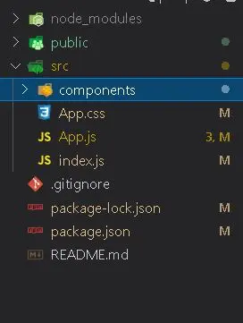
First, create a components folder in your src directory, and in that components folder, create a “BlobSvg.jsx” component that will hold our blob for the nav link.
Your project structure should look like this:
You can then make your BLOB for free from Softr.io. Copy the SVG into your BLOB component. After everything, you should have this:
import React from "react";
function BlobSvg() {
  return (
      <svg  style={{ cursor: "pointer" }}
        viewBox="0 0 200 200"
        xmlns="http://www.w3.org/2000/svg">
        <path
          fill="#ff9fda" d="M41.9,-50.6C55.9,-38.2,69.8,-26.5,72.8,-12.4C75.8,1.6,67.7,18,58.4,33.5C49.2,48.9,38.8,63.4,23.4,72.6C8,81.9,-12.4,85.9,-29.9,80.3C-47.5,74.8,-62.4,59.7,-71,42.2C-79.7,24.7,-82.2,4.9,-76,-10.5C-69.9,-26,-55.1,-37,-41,-49.3C-26.8,-61.7,-13.4,-75.4,0.3,-75.7C14,-76,27.9,-63,41.9,-50.6Z"
          transform="translate(100 100)"
        />
      </svg>
  );
}
export default BlobSvg;
Including the BLOB in the Links to Animate
Now we have our BLOB, let’s include our BLOB in the links and start animating.
You can refactor your code with the navbar as a new component for easy debugging. Here is the code:
import React from "react";
import {CartContainer} from './CartComponent/CartContainer.jsx'
import BlobSvg from "./BlobSvg";
function Navbar() {

	/// THE LINKS ARE REFACTORED IN A USE STATE,
/// TO ANIMATE OUR BLOB ON HOVER FOR EACH LINK ITEM
  const [linkList, setLinkList] = React.useState([
    "Home",
    "About",
    "Collections",
    "Category",
  ]);
   return (
    <div
      className="navbar"
    >
      <img
        src="/assets/img/logo.png"
        alt="logo"
      />
      <nav >
        <ul>
		/// We map through the nav links, so we can use the id
		/// to control which item is being hovered on.
          {linkList.map((link, id) => {
            return (
		/// currentLink changes onMouse enter
              <li key={id} onMouseEnter={() => setCurrentLink(id)} onMouseLeave={() => setCurrentLink(0)}>
                <a href="/">{link}</a>

		/// BlobSvg Only shows when the current Link matches the id

                {id === currentLink && (
                  <BlobSvg />
                )}
              </li>
            );
          })}
        </ul>
      </nav>
      <img src="/assets/img/shopping-cart.png" alt="cart" width="40px" height="40px" />
    </div>
  );
}

export default Navbar;
Animating the “NavBar” Items
Now, let’s animate the NavBar items.
You prefix the container of your navbar with “motion” (so <motion.div>). Next, we create a variant for both sides. We can pass in two variant objects (hidden and visible) to stand for our initial and animate props in the element. The “staggerChildren” prop helps to animate the parent element’s children with the variant property. Let’s check the following code:
const variants = {
    visible: {
      opacity: 1,
      transition: {
        staggerChildren: 0.2,
      },
    },
    hidden: { opacity: 0 },
  };
Then, in our Component, we use the variants as a variant prop. The Initial and animate values read from the names we set in the variant object, and the animation values from that object are set accordingly.
<motion.div
      className="navbar"
      variants={variants}
      initial="hidden"
      animate="visible">
Also, we will need to set a variant for our navbar items to work accordingly, so they have their animation outside the parent animation. We can then use them in the HTML element. The same goes for the “BlogSvg” component.
const navbarItems = {
    visible: {
      opacity: 1,
      y: [-100, 20, 0],
    },
    hidden: {
      opacity: 0,
      y: 0,
    },
  };
  const svgContainerVariants = {
    hover: {
      color: "#ff77cd",
    },
    visible: {
      opacity: 1,
      y: [-100, 20, 0],
      transition: {
        duration: 0.55,
        easing: "easeInOut",
        when: "beforeChildren",
        staggerChildren: 0.1,
      },
    },
    hidden: {
      opacity: 0,
      y: [-100, 20, 0],
    },
  };
Notice how we use the array instead of one value for the ‘y’ properties. The values are animated in pixels, but you can overwrite them with a string literal (e.g., ‘-100vw’).
Finally, we create a “useState” that allows us to control which of the links are currently hovered on.
const [currentLink, setCurrentLink] = React.useState(0);Then, when the navigation link’s id matches the current link state, the SVG will show. The code follows:
 {linkList.map((link, id) => {
            return (
      <motion.li key={id} variants={svgContainerVariants}
      onMouseEnter={() => setCurrentLink(id)}
      onMouseLeave={() => setCurrentLink(0)}>
                <a href="/">{link}</a>
                {id === currentLink && (
                  <BlobSvg variants={svgContainerVariants} />
                )}
            </motion.li>
            );
          })}
Your Navbar Component should look like this:
import React from "react";
import { motion } from "framer-motion";
import BlobSvg from "./BlobSvg";
function Navbar() {
  const [currentLink, setCurrentLink] = React.useState(0);
  const [linkList, setLinkList] = React.useState([
    "Home",
    "About",
    "Collections",
    "Category",
  ]);
  const variants = {
    visible: {
      opacity: 1,
      transition: {
        staggerChildren: 0.2,
      },
    },
    hidden: { opacity: 0 },
  };

  const navbarItems = {
    visible: {
      opacity: 1,
      y: [-100, 20, 0],
    },
    hidden: {
      opacity: 0,
      y: 0,
    },
  };

  const svgContainerVariants = {
    hover: {
      color: "#ff77cd",
    },
    visible: {
      opacity: 1,
      y: [-100, 20, 0],
      transition: {
        duration: 0.55,
        easing: "easeInOut",
        when: "beforeChildren",
        staggerChildren: 0.1,
      },
    },
    hidden: {
      opacity: 0,
      y: [-100, 20, 0],
    },
  };
  return (
    <motion.div
      className="navbar"
      variants={variants}
      initial="hidden"
      animate="visible"
    >
      <motion.img
        src="/assets/img/logo.png"
        alt="logo"
        variants={navbarItems}
      />
      <motion.nav variants={navbarItems}>
        <ul>
          {linkList.map((link, id) => {
            return (
              <motion.li key={id} variants={svgContainerVariants}
    		onMouseEnter={() => setCurrentLink(id)}
 		onMouseLeave={() => setCurrentLink(0)}>
                <a href="/">{link}</a>
                {id === currentLink && (
                  <BlobSvg variants={svgContainerVariants} />
                )}
              </motion.li>
            );
          })}
        </ul>

      </motion.nav>
      <motion.img variants={navbarItems}
src="/assets/img/shopping-cart.png" alt="cart" width="40px"
height="40px" />
    </motion.div>
  );
}

export default Navbar;
Building Additional Features with Framer Motion
Summary of the points covered till now
Till now, we learned about Framer motion and how to use it. We also built a small modern webpage with custom animations to fit our needs.
- Framer Motion is a ready-made animation library to help you create powerful animations with minimal code.
- We can use Framer Motion by prefixing your div components with a “motion” component. (e.g. <motion.div>)
- Initial and animated props control the animation’s initial and final state on page load.
- Variants help us to set the animation and initial props declaratively.
Adding new features
Let us check how to add additional features on top of our previous build. For example, we will create a modal with an interpolated background that changes its color when an element is dragged left or right. Also, I will later explain many new Framer motion terms and concepts like interpolation and hooks.
(This example uses an excerpt from the Framer Motion Sandbox. You can check it out here).
New Terminologies
Before we start building our Modal, let’s understand a few concepts we can use to build our Modal Component.
(You can read more about these topics on Framer Motion Docs.)
Animate Presence
So, we know how the modal works. It enters and leaves the screen based on a user event.
With React, we have the “useEffect” hook to tell us when our Modal gets mounted on the screen, but we need a way to track when it leaves the screen. That’s where the AnimatePresence component comes in.
So we have to wrap our Modal with the AnimatePresence component and then pass an “exit” prop, which allows us to animate our Modal as it leaves the screen. We will see this in action shortly.
Interpolation
Interpolation is a powerful tool that allows us to change values within a fixed range dynamically. When we want to interpolate between certain values, we pass in our input range (e.g., the position of an element) and then an output range (e.g., the opacity of an element) to control the result of our values. To better explain interpolation, here’s a table:
| Position (x) – Input Range | 1 | 1.5 | 2 |
| Opacity- Output Range | 0 | 0.5 | 1 |
According to the table above, when an element’s position is at value 1, we set the opacity to 0, and when the position is at 2, the opacity becomes 1. This is an interpolation between two values.
In the case of our Modal, our input value is the position of the box element as it gets dragged, and then, with each change in the position, we will have a range of output colors that will be interpolated relative to our position.
So, with this, we can dynamically change the background color of our Modal and draw out the SVG (Scalable Vector Graphics) in the box component as it is dragged, which leads us to the next term.
Drag and Drag Constraints
The drag component is pretty explanatory. It is a prop we can pass to our motion.div element to make it draggable. Other props we can pass into it include the dragConstraints, which resets the element back to the constraints passed, and “dragElastic,” which helps us control the degree to which we can drag our box element.
“UseMotionValue” and “useTransform”
The “useMotionValue” hook allows us to create a dynamic value that we can use to control our animation states. The “useMotionValue” state is frequently used with the “useTransform” hook, which we will see shortly.
Getting Started
Here’s the Github for the finished tutorial
To ensure we are on the same page, this is part of the code from the previous section:
App.js:
import "./App.css";
import React from "react";
import { motion } from "framer-motion";
import Navbar from "./components/Navbar.jsx";
function App() {
  return (
      <div className="container">
        <Navbar />
        <div className="container_body">
          <motion.div
            initial={{ opacity: 0 }}
            animate={{ opacity: 1 }}
            className="content"
          >
            <motion.a
              whileHover={{
                scale: 1.2,
                boxShadow: "5px 4px 8px 2px #87adfe",
                color: "#000",
                transition: {
                  type: "tween", },
              }}
              className="btn"
            >
              Outfit Of The Week
            </motion.a>
            <h1>
              You should always
              <br /> feel pretty
            </h1>

            <p>Clothes that are sure to heat up</p>
          </motion.div>

          <motion.img
            src="/assets/img/img.png"
            alt="next"
            className="feature-img"
            initial={{ opacity: [0,0.5,1], x: "-100vw" }}
            transition={{ type: "string", stiffness: 600, delay: 0.35 }}
            animate={{ opacity: [0, 0.5, 1], x: [-1500, 35, 0] }}
          />
        </div>
        <div className="social-links">
          <a href="#">FACEBOOK</a>
          <a href="#">INSTAGRAM</a>
          <a href="#">TWITTER</a>
        </div>
      </div>
  );
}
export default App;
Navbar.jsx:
import React from "react";
import { motion } from "framer-motion";
import BlobSvg from "./BlobSvg";
function Navbar() {
  const [currentLink, setCurrentLink] = React.useState(0);
  const [linkList, setLinkList] = React.useState([
    "Home",
    "About",
    "Collections",
    "Category",
  ]);
  const variants = {
    visible: {
      opacity: 1,
      transition: {
        staggerChildren: 0.2,
      },
    },
    hidden: { opacity: 0 },
  };

  const navbarItems = {
    visible: {
      opacity: 1,
      y: [-100, 20, 0],
    },
    hidden: {
      opacity: 0,
      y: 0,
    },
  };
  const svgContainerVariants = {
    hover: {
      color: "#ff77cd",
    },
    visible: {
      opacity: 1,
      y: [-100, 20, 0],
      transition: {
        duration: 0.55,
        easing: "easeInOut",
        when: "beforeChildren",
        staggerChildren: 0.1,
      },
    },
    hidden: {
      opacity: 0,
      y: [-100, 20, 0],
    },
  };
  return (
    <motion.div
      className="navbar"
      variants={variants}
      initial="hidden"
      animate="visible"
    >
      <motion.img
        src="/assets/img/logo.png"
        alt="logo"
        variants={navbarItems}
      />
      <motion.nav variants={navbarItems}>
        <ul>
          {linkList.map((link, id) => {
            return (
              <motion.li key={id} variants={svgContainerVariants}
 		onMouseEnter={() => setCurrentLink(id)}
 		onMouseLeave={() => setCurrentLink(0)}>
                <a href="/">{link}</a>
                {id === currentLink && (
                  <BlobSvg variants={svgContainerVariants} />
                )}
              </motion.li>
            );
          })}
        </ul>
       </motion.nav>
      <motion.img variants={navbarItems} src="/assets/img/shopping-cart.png" alt="cart" width="40px" height="40px" />
    </motion.div>
  );
}
export default Navbar;
Now, we want to create a modal Component that will cover the screen on clicking a button. In your components folder, create a new folder called ModalComponent, and then in that folder, create a file called “ModalComponent.jsx”. Also, create a Draggable Component in the ModalComponent folder, which will stand for the box.
First, we will write up the HTML and CSS. Feel free to style this however you want.
ModalComponent.jsx:
import { DraggableComponent } from "./DraggableComponent";
export const ModalComponent = () => {
  return (
        <div
          className="modal-container"
        >
          <div className="modal-main">
          <span>x</span>
            <div
              className="img-container"
            >
              <img src="/assets/img/img.png" alt="outfit-of-the-year" />
            </div>
            <div
              className="outfit-div"
            >
              <h2>Outfit Of The week</h2>
              <p>Do you like this product?</p>
              <p>(Click and drag Left or Right)</p>
              <div
                style={{
                  marginTop: "30px",
                  display: "flex",
                  justifyContent: "center",
                  alignItems: "center",
                }}
              >
                <DraggableComponent />
              </div>
            </div>
          </div>
        </div>
  );
            }
Then, our draggable component will be a simple box with the different SVGs inside.
import * as React from "react";
export const DraggableComponent = (
  return (
    <div className="example-container" style={{ background: "none" }}>
      <div>
        <svg className="progress-icon" viewBox="0 0 50 50">
          <path
            fill="none"
            strokeWidth="2"
            stroke={color}
            d="M 0, 20 a 20, 20 0 1,0 40,0 a 20, 20 0 1,0 -40,0"
            style={{ translateX: 5, translateY: 5 }}
          />
          <path
            fill="none"
            strokeWidth="2"
            stroke={color}
            d="M14,26 L 22,33 L 35,16"
            strokeDasharray="0 1"
            style={{ pathLength: 0}}
          />
          <motion.path
            fill="none"
            strokeWidth="2"
            stroke={color}
            d="M17,17 L33,33"
            strokeDasharray="0 1"
            style={{ pathLength: 0}}
          />
          <motion.path
            fill="none"
            strokeWidth="2"
            stroke={color}
            d="M33,17 L17,33"
            strokeDasharray="0 1"
            style={{ pathLength: 0}}
          />
        </svg>
      </motion.div>
    </motion.div>
  );
};
Notice that the “pathLength” of the SVG’s is set to 0. This is the value we will be interpolating, so based on if we drag left or right, the “pathLength” of the respective SVG will be drawn (changed from 0 to 1).
Next CSS for Covering Full Screen
Lastly, our CSS must ensure that our modal covers the screen once opened. Here we go with our code:
/* MODAL CONTAINER */
.modal-container {
  z-index: 999;
  overflow: hidden;
  background: rgba(44, 29, 38, 0.6);
  cursor: pointer;
  position: fixed;
  display: flex;
  justify-content: center;
  align-items: center;
  width: 100%;
  height: 100%;
}

.modal-main {
  width: 70%;
  height: 85%;
  position: relative;
  display: flex;
  flex-direction: row;
  align-items: center;
  justify-content: center;
  background: linear-gradient(45deg, #87adfe, #1b1b1b);
  border-radius: 15px;
  flex-wrap: wrap;
  padding: 20px;
}
.modal-main span {
  position: absolute;
  top: 50px;
  right: 50px;
  color: #fff;
  font-weight: bold;
  cursor: pointer;
}
.modal-main span:hover {
  opacity: 0.75;
}
.img-container {
  height: 80%;
  text-align: center;
  flex: 1 1 400px;
}

.img-container img {
  height: inherit;
}

.outfit-div {
  flex: 1 1 400px;
  text-align: center;
}

.outfit-div h2 {
  color: rgba(44, 29, 38, 0.6);
  font-size: 40px;
}
.outfit-div p {
  color: rgba(255, 255, 255, 0.6);
  font-size: 25px;
  margin-top: 20px;
}

/* BOX CLASS */
.example-container {
  width: 110px;
  display: flex;
  justify-content: center;
  align-items: center;
}

.box {
  background: white;
  border-radius: 30px;
  width: 100px;
  height: 100px;
  left: calc(100% - 150px / 2);
  display: flex;
  justify-content: center;
  align-items: center;
}
.progress-icon {
  width: 80%;
  height: 80%;
}
So first, back in our App.js file, we will include our modal component to the top level of our div. Then, we create a “useState” to control the “classNames” for when the Modal should be visible or not.
const [isVisible, setIsVisible] = React.useState(false);Then, we pass both states into the “ModalComponent” so we can control it from inside the modal.
<ModalComponent isVisible={isVisible} setIsVisible={setIsVisible} />We then set up a simple ternary in the modal component to show the modal if “isVisible” is true and null if it’s not.
{isVisible && (...)}Next, we can now start our setup. First, wrap the entire modal component with an “AnimatePresence” Component. Then, in your root div (which is actually <motion.div>), you set an “exit” prop along with your initial and animate values.
With this setup, we have completed the modal to open and close. Then, just set up an “onClick” function on the “outfit button” to “setVisible” to true “onClick”.
onClick={() => setIsVisible(true)}Now we can work on the interpolation in the “ModalComponent.”
First, we create an input motion value to serve as the input value we interpolate with, i.e., the position value as we drag the box, and we create a range of values that our “motionValue” will change too, which is our input value. Then, finally, we create a “useTransform” hook that will piece together our “motionValue” input value and then the output value so that they get interpolated.
Here’s what that looks like:
const x = useMotionValue(0); /// Motion Value that serves as the position
  const xInput = [-100, 0, 100]; //Input value to control the position limit
  const background = useTransform(x, xInput, [
    "linear-gradient(125deg, #ff008c 0%, #1b1b1b 100%)",
    "linear-gradient(45deg, #87adfe 0%, #1b1b1b 100%)",
    "linear-gradient(-90deg, rgb(3, 209, 0) 10%, #1b1b1b)",
  ]);
  /// useTransform hook that interpolates between the position and then the     range of colors will come out as an output, based on the value of our useMotionValue.
After this interpolation, we have to set this interpolated value as a style into our “motion.div” element. Let’s code it:
<AnimatePresence>
      {isVisible && (
        <motion.div
          initial={{ opacity: 0, scale: 0 }}
          animate={{ opacity: 1, scale: [0,1.1,1] }}
          exit={{opacity:[1,0.8,0], scale: [1, 1.1, 0] }}
          className="modal-container">
          <motion.div className="modal-main"  style={{ background}}> ///background style set from interpolate value
Setting the Drag Prop into the Box Element
We have the background interpolated at this stage, but we must set the drag prop into the box element, i.e., “DraggableComponent”. So go into your “DraggableComponent.jsx” and create your draggable element first. Then, feel free to style it as you want.
We must create interpolated values for the “pathlength”, so it only draws as we click and drag. So, it will also be with the “useTransform” hook.
We will also create interpolated values for the color of the SVG as it is dragged left or right. The input value is such that when the position is set to negative (e.g., 100). It means we are dragging the element to the left, and a positive value is to the right. Let’s see the code:
const color = useTransform(x, xInput, [
    "rgb(211, 9, 225)",
    "#87adfe",
    "rgb(3, 209, 0)",
  ]);
  const tickPath = useTransform(x, [10, 100], [0, 1]);
  const crossPathA = useTransform(x, [-10, -55], [0, 1]);
  const crossPathB = useTransform(x, [0, -100], [0, 1]);
///The interpolated values are created in the ModalComponent and then received as props into the draggable component.
After creating your simple box or any shape, just change the parent container to a “motion.div” and then create your drag prop set to the value of ‘x’ (our useMotionValue).
Here’s an example of what it will look like:
import * as React from "react";
import { motion, useMotionValue, useTransform } from "framer-motion";

export const DraggableComponent = ({
  color,
  tickPath,
  crossPathA,
  crossPathB,
  x,
}) => {
  return (
    <motion.div className="example-container" style={{ background: "none" }}>
      <motion.div
        className="box"
        style={{ x }}
        drag="x"
        dragConstraints={{ left: 0, right: 0 }}
        dragElastic={0.2}
        transition={{
          type: "string",
          stiffness: 6,
        }}
      >
        <svg className="progress-icon" viewBox="0 0 50 50">
          <motion.path
            fill="none"
            strokeWidth="2"
            stroke={color}
            d="M 0, 20 a 20, 20 0 1,0 40,0 a 20, 20 0 1,0 -40,0"
            style={{translateX: 5, translateY: 5}}
          />
          <motion.path
            fill="none"
            strokeWidth="2"
            stroke={color}
            d="M14,26 L 22,33 L 35,16"
            strokeDasharray="0 1"
            style={{pathLength: tickPath}}
            /// we change the pathlength from 0 to the interpolated length
			/// so, it draws the svg as the component is dragged.
          />
          <motion.path
            fill="none"
            strokeWidth="2"
            stroke={color}
            d="M17,17 L33,33"
            strokeDasharray="0 1"
            style={{pathLength: crossPathA}}
          />
          <motion.path
            fill="none"
            strokeWidth="2"
            stroke={color}
            d="M33,17 L17,33"
            strokeDasharray="0 1"
            style={{pathLength: crossPathB}}
          />
        </svg>
      </motion.div>
    </motion.div>
  );
};
And with that, we have completed the modal feature.
Thanks for reading. I hope this guide about using Framer Motion with React will be useful for building Progressive Web Applications.
Please refer to the GitHub link if you encounter any issues.

Somto Achu is a software engineer from the U.K. He has rich years of experience building applications for the web both as a front-end engineer and back-end developer. He also writes articles on what he finds interesting in tech.